Our monthly series asks: How do you bring color into luxury design? Used with care, yellow is uplifting, writes Jill Krasny
London, England | United Kingdom Sotheby’s International Realty
Some homes quickly fade from the mind while others are unforgettable. Often the design scheme is a factor. Pink can be surprisingly grounding and red gets people talking, while yellow—which our series on color in design turns to next—is notoriously hard to handle, but can deliver amazing results.
“When I’m thinking about yellow, the first room that comes up for me is the Yellow Room by Nancy Lancaster and John Fowler,” says London-based interior designer Rachel Chudley of their famed reception room at 39 Brook Street, Mayfair. “That for me is yellow at its best—it’s somehow luminous, it’s warm, it pulls everything together, but it also feels bold,” she says.
The variations—and contradictions—of yellow have captivated artists for centuries, as the Van Gogh Museum in Amsterdam explores in its current exhibition, “Yellow. Beyond Van Gogh’s Colour.” However, they can also make the color tricky to work with, especially as a pastel. “It’s really difficult not to make it too insipid,” says Chudley, “and maintain that kind of lightness.”
Still, she notices more and more people are gravitating to yellow in luxury design schemes again, while drawing on its layered historical associations.

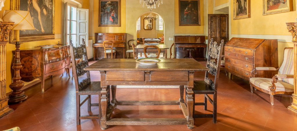
Florence, Italy | Italy Sotheby’s International Realty
A charming 16th-century villa near Florence feels in tune with its verdant surroundings thanks to its faded ochre exterior. “It’s got that plastery warmth, which feels kind of natural there, very Italian,” says Chudley, noting the extensive use of the color during the Florentine Renaissance.
The weathered appearance, made all the more noticeable due to the material’s application, also “lends itself to this clay-pot feel,” she adds. Yellow is deployed throughout the interiors too, a striking backdrop to the home’s extensive collection of traditional furniture and fine art.
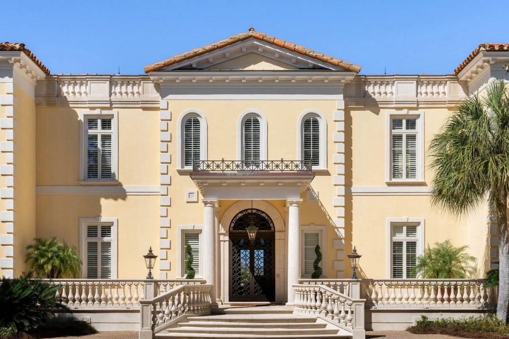
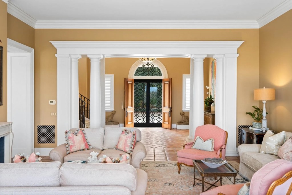
Sea Island, Georgia | DeLoach Sotheby’s International Realty
By contrast, Villa Measured, a neoclassical residence within a gated estate on Sea Island, a private island in Georgia, appears lighter and brighter. “This yellow feels like the John Soane yellow,” says Chudley, referring to the house museum of the English architect Sir John Soane.
Soane’s drawing room, painted Turner’s Yellow—a pigment developed in the late 18th century—is truly a statement. The same hue works in Georgia, says Chudley, because “they’re leaning into that classically proportioned architecture,” which complements the clear blue sky.
Sea Island, Georgia | DeLoach Sotheby’s International Realty
A sprawling estate on Merritt Island, on the east coast of Florida, similarly pays homage to traditional Florentine villas with its butter-yellow exterior and distinctive Italian stone fountains.
Inside, the sizable Tuscan-style kitchen and adjacent dining area continue the theme, though the true star is the home’s neoclassical exterior, which contrasts beautifully with Florida’s violet-streaked sunset. “This is a perfect hot weather color,” says Chudley. Anything lighter would feel washed out.
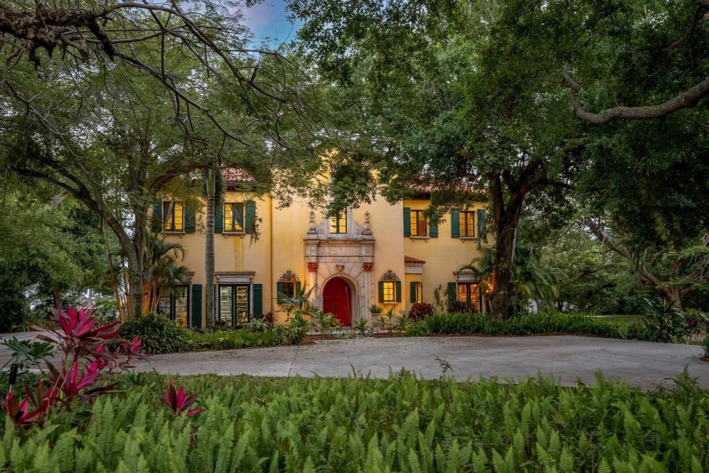
Merritt Island, Florida | ONE Sotheby’s International Realty
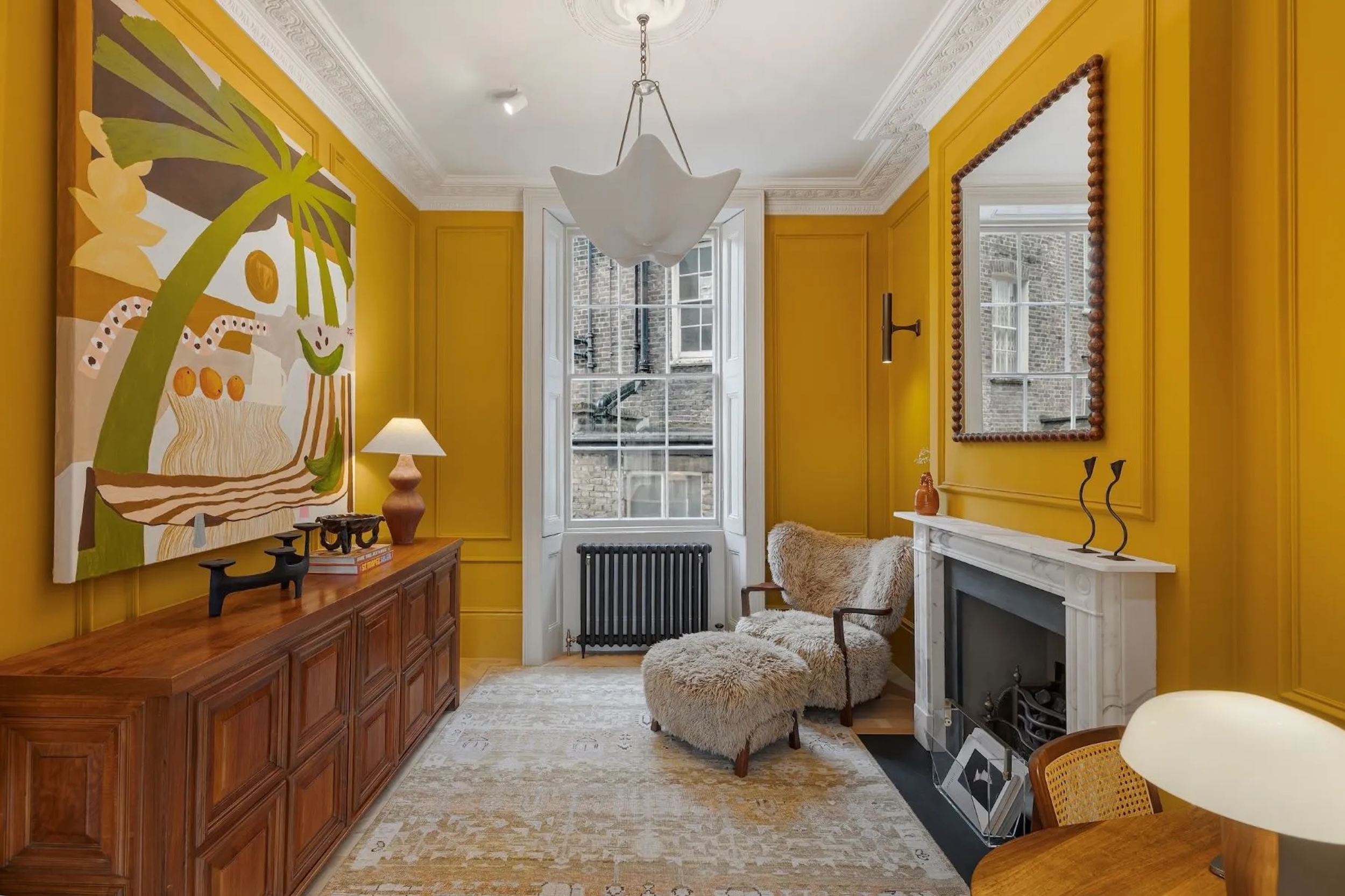
In London, meanwhile, a spacious townhouse on Kendal Street near Hyde Park uses a turmeric shade of yellow to set off the grayness outside. “It’s the classic London brick with the gray London light coming through,” says Chudley.
A key part of selecting a paint color is working with or against the view, she says, and here the color draws your eye away from the window. “If you have an amazing view, you want to bring it in,” she says. Here, the color feels “like a warm hug” on a cold, foggy day.